Entry Level

Critique: I think you did a great job with the depth of field and shutter speed. It’s a delicate balance when it comes to small birds in flight. I’m impressed. When it comes to shots like this, I thin k you would be well served to have some context that places the subject at or near something to reference that would add to the story and emotional impact. That being said, well done.
Score: 4
Award: 1st Place
Intermediate Level
Photographer: Fritz Fryer
Title: Springtime in Texas

Critique: This is what I remember about the springtime landscape in east Texas. I think the composition is strong. To my eyes the colors are a bit muted. I see that manifested in a pale blue sky. I think an increase in blue and purple saturation could strengthen the visual impact. Those Texas Bluebonnets are much bluer and should reach out and grab you.
Score: 3
Photographer: Kelly Hernandez
Title: Folly Beach Sunrise

Critique: I see a very nice example of the effects of a long shutter at the beach. The silky water is surreal. For me the nearest large rock overwhelms the story. To me the story is in the water and lighthouse accented by the low sun. For a shot like this, I think a sky reflection of the orange would be a great dramatic effect. Maybe a 1 x 3 crop ratio to simulate a panorama would be very dynamic and help conceal the large bolder.
Score: 4
East Texas Camera Club
May 2026 - Color or Monochrome
Judge: Kurtis Sutley
Photographer: Wes Jones
Title: Clear for Takeoff
Photographer: Lisa Lowry
Title: Float

Critique: This is a very interesting subject. The colors are very dramatic. To me, the space in the foreground suggests the trio of lily pads (?) are pushed to the back of the image. I think some selective saturation of the reds and oranges would add color contrast and interest. I like that you left the sky reflection a dark blue to complement the red/orange and green colors.
Score: 4
Photographer: Ronald Rang
Title: Paradise Valley MT

Critique: The more I look at this picture, the more I like what I see. For one thing, I like how the line of the field top is a near mirror image of the mountain skyline. I see a balance and symmetry missing in many landscapes. There appears to be an even divide between the foreground, mountains and sky that serves to relax and bid me to visit. In my opinion, the only thing missing is herding animals to lend context. Maybe they are available at B & H. LOL
Score: 4
Photographer: Sharla Drain
Title: I’m De’Coriyan

Critique: I see someone on the street and I’m curious what he’s thinking. I’m not sure if he’s irritated or just wrapped up in what he’s hearing in his headphones. I think a smile would have destroyed the moment. Very nice contrast. Can’t find fault with the composition. If this was staged, you deserve an Oscar for directing. Well done.
Score: 1
Award: 1st Place
Advanced Level
Photographer: Amy Dumas
Title: Female Cardinal in Flight

Critique: Based on the facial expression, I would attribute a certain shyness to this lovely bird. To me the image is soft but that works with this subject. The colors are soft but that works too. For me a small bird in flight begs for something (anything) to add context to the story. With no vertical or horizontal background references, I think a slight tilt to one side would add interest and visual dynamics. This is a hard shot to get, and you should be proud of your effort.
Score: 4
Photographer: Larry Golden
Title: You Must Pay the Toll

Critique: How could anyone say no to this handsome pair. The sepia works well. To me a radial gradient that adds contrast would really make this image pop. It looks to me that the lens blur needs to extend to the dark trees in the background. I wouldn’t say NOT to blur the background, but remember, you already have two natural leading visuals with the tree tunnel and the road. Nice job.
Score:
Photographer: Alan Roberts
Title: Beach Fun
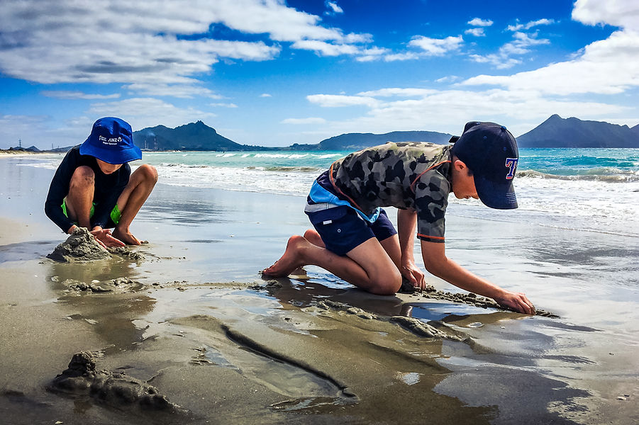
Critique: There was something about this image the first (and second) time I looked at it. I like the forced perspective that allowed you to bring everything into focus. I like how the children are too busy to look up. Every design element is represented…and it just grabbed my attention.
Score: 5
Photographer: Lily Green
Title: My Eye on You

Critique: This image is tack sharp and the focus and colors are vivid. I find the bright red eye dramatic and mysterious. I think having the eye slightly off center adds to the dramatic effect. Very provocative.
Score: 4
Photographer: Jeanne Harford
Title: Spring Green

Critique: I find this a very inviting view of a peaceful swamp-like landscape. I like the textures and especially the use of reflections to add depth. I find myself drawn into the image seeking what may be beyond the next turn. Nice depth of field. Maybe a little dehaze or highlight reduction would add extra mystery and drama. For me, the extra foreground below the root structure on the left competes for my attention to be pulled into the image. Cropping that out would also put the “horizon” at the 1/3 line and balance the composition. Just a thought.
Score: 4
Photographer: Dolph Miller
Title: Magnificent

Critique: Many photographers have no understanding of the work needed for an image as simple and yet complicated as this. Sometimes less is more. I think cloning out the distracting faint leaves on the right background would fine tune an already stunning image. Nicely done.
Score: 5
Awards: 1st Place
Photographer: Cliff McKenzie
Title: When Political Discussions Sour

Critique: I think this is a nice action wildlife shot. I like the composition and the appropriate shutter speed and aperture to isolate the subjects. For me the only (but significant) issue is not being able to see the other half of the story, the head and reaction of the crane on the right. When reviewing images to submit for competitions or critique, ask yourself, “What would make this a better image?”.
Score: 3