PSA Photo Critiques
Photographer:
Title:
Level:
Score:
Award:
Year/Month:
Larry Golden
St. Bontiface
Advanced
5
2026
/
September
Critique:
Flipping this image will give you a very different feel that this orientation. I can't tell you which one you will like the best, as I actually quite like both to them. Each story is just a little different. You did a very nice job of blending the monochrome with the color. Good job.

Photographer:
Title:
Level:
Score:
Award:
Year/Month:
Alex Woodcock
Splish Splash
Advanced
4
2026
/
September
Critique:
This is a sweet, fun image. However, the composition would be helped enormously if you flip the image. Yes, you then have to blur out the numbers, but a few minutes on that, and you have a much stronger result.

Photographer:
Title:
Level:
Score:
Award:
Year/Month:
Alan Roberts
Under Construction
Advanced
4
2026
/
September
Critique:
I like the story here, and the technicals are good. My one real problem is that I want to see more of his face and hands. Although strong, the composition would be even stronger with a few degrees of shift.

Photographer:
Title:
Level:
Score:
Award:
Year/Month:
Jeanne Harford
Forged
Advanced
5
1st Place
2026
/
September
Critique:
This is a very strong image. The story is clear with loads of impact. The technicals are use perfectly to help convey the story. It is powerful and evocative. I can't think of a suggestion to make. If I saw this in an international, I'd give it a high score.

Photographer:
Title:
Level:
Score:
Award:
Year/Month:
Lily Green
Contemplation
Advanced
3
2026
/
September
Critique:
She appears to be a sweet girl deep in thought - just as the title implies. My problem with this image is that I see a photo mostly of a white shirt with other incidentals in the shot, including the girl. I suggest that you work on her to make her stand out more from her bright white shirt.

Photographer:
Title:
Level:
Score:
Award:
Year/Month:
Dolph Miller
Wired Fence
Advanced
3
2026
/
September
Critique:
This is a well lit, sharp, well exposed, colorful photo of a fence. For me, it cries out for some kind of center of interest. Perch a bird on it somewhere, and you could have a winner.

Photographer:
Title:
Level:
Score:
Award:
Year/Month:
Larry Gilley
Taking a Break
Intermediate
4
2026
/
September
Critique:
The technicals here are all excellent. With the bird smack dab in the center of the frame, I find the composition to be too static. I opened it up and played with the cropping. I liked it much better after moving in from the left until the right ordinal line crossed his right leg. Now you have him with his eye and this leg on ordinals. This way, the viewer still gets the feeling of lonesomeness and space.

Photographer:
Title:
Level:
Score:
Award:
Year/Month:
Fritz Fryer
Fueling up for the Southern Trip
Entry
5
2026
/
September
Critique:
This is lovely. The colors are vibrant, but not garish. It is sharp where it is suppose to be, and the soft background works perfectly. I really like the composition - well balanced and keeps the eye in the frame. Well done.

Photographer:
Title:
Level:
Score:
Award:
Year/Month:
Devin Abbe
Gator Eye
Intermediate
4
2026
/
September
Critique:
Very interesting, with good impact. The blacks and whites are very flat, and need work to give them the punch to match the eye. Using Photoshop Camera Raw Filter to work on the overall exposure and the brightness/color of the eye can really make this image pop.

Photographer:
Title:
Level:
Score:
Award:
Year/Month:
Sharla Drain
The Reflections
Intermediate
5
1st Place
2026
/
September
Critique:
I like the feeling of this image, and I really like the story. Sepia and slight grunge seem to just "fit" this image, and the frame you picked is perfect for it. This imparts a feeling of nostalgia in a good way.

Photographer:
Title:
Level:
Score:
Award:
Year/Month:
Wes Jones
Feeder Faceoff
Intermediate
4
2026
/
September
Critique:
I know that we often have to take the images that present themselves to us. I only wish that these birds have been facing you. The image would have have so much more impact the interest. As it is, the technicals are good - which with birds, sharpness it difficult to achieve. Personally, I am not a fan of so much bokeh dots, as I have a hard time keeping my eyes from being drawn to them.

Photographer:
Title:
Level:
Score:
Award:
Year/Month:
Ron Rang
I Fall For You
Intermediate
3
2026
/
September
Critique:
This could be lovely, but I find the water to be off color. I've shot a lot of waterfalls, and few are that cyanish-green. I suggest selecting the falls, and working of the taking out a lot of the color. The rest of the image is fine, except I think that I'd like a little more scenery on the left. The falls are too centered.

Photographer:
Title:
Level:
Score:
Award:
Year/Month:
Kelly Hernandez
Infinity Arches
Intermediate
3
2026
/
September
Critique:
The composition here is excellent. The image suffers from flat lighting, leaving only pale greys and no clear whites. One easy way to work on this is in Camera Raw Filter in Photoshop. Go to Exposure and slide the sliders around, emphasizing the black and shadow. I wouldn't mess with the bottom of the image - to me that area looks pretty well exposed.

Photographer:
Title:
Level:
Score:
Award:
Year/Month:
Bob Ward
Hard Save by the Goalie
Intermediate
4
2026
/
September
Critique:
This is an excellent Photojournalism shot. I know that you wanted to close in on the action, but if you do have the room, I think that a little more room in the right would help. It feels like she is about to bump her head on the frame of the image.

Photographer:
Title:
Level:
Score:
Award:
Year/Month:
Margaret Smith
The Lookout
Intermediate
4
2026
/
September
Critique:
I love to watch birds be lookouts as you say. This image captures the feeling of that really well. Personally, I think that it would be much improved it you faced the bird the other way. Here he feels cramped to me. Turn him around, and pow, he has lots of room. By the way, other than the composition, your technicals are excellent.

Photographer:
Title:
Level:
Score:
Award:
Year/Month:
Susan Lewis
Mom’s Special Kiss
Intermediate
4
2026
/
September
Critique:
I love the subject. You capture the story very well. Unfortunately, there is a lot of noise and the deer are not truly sharp. My main problem in that you left no room for the doe on her backside. It bothers me a lot. Please always at least try to leave room for movement for those things that can move. There are lots of really good denoising and sharpening software out there. Photoshop is pretty good at it too.

Photographer:
Title:
Level:
Score:
Award:
Year/Month:
Cliff McKenzie
Looking Forward in America
Advanced
5
1st Place
2026
/
September
Critique:
I really like this. All the technicals are perfect. The story is clear, and there is loads of impact. Well done. If I saw this in an international, I'd give it a high score.

Photographer:
Title:
Level:
Score:
Award:
Year/Month:
Larry Golden
Anticipation
Advanced
5
1st Place
2026
/
August
Critique:
Excellent focus, clarity and exposure. The nicely blurred background keeps the focus on your three main subjects. This image tells a story

Photographer:
Title:
Level:
Score:
Award:
Year/Month:
Amy Dumas
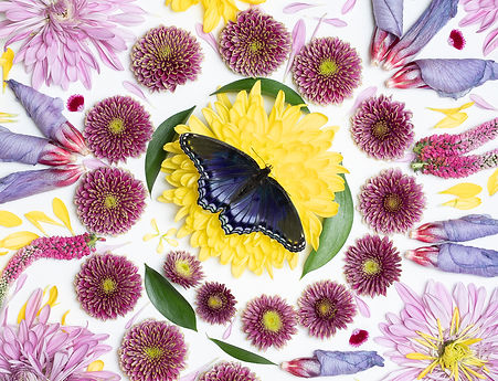
All Things Bright and Beautiful
Advanced
4
2026
/
August
Critique:
The focus and details on everything are excellent. The symmetrical composition works well. There are so many objects that the image appears very busy, although the butterfly in the center gives the viewer’s eye a place to rest.
Photographer:
Title:
Level:
Score:
Award:
Year/Month:
Lily Green
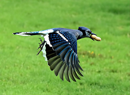
Nuts to You (or Me)
Advanced
3
2026
/
August
Critique:
You stopped the action well. The bird and peanut are in perfect focus. You left room for the bird to fly into in your composition. You have nice color throughout. It would have been nice to see a little detail and maybe a catchlight in the eye.